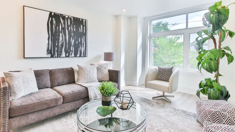

Mixing and matching colors in home decor starts with light, a simple palette, and a clear balance of shades. The same paint can look soft in daylight and dull by evening, so testing color in your room matters. A 60-30-10 mix helps keep bold, neutral, warm, and cool tones working together. With a few smart choices, your space can feel cohesive, relaxed, and full of personality.
Choose a Color Palette for Your Room
Before you buy a single pillow or paint sample, choose a clear color palette for the room so everything feels calm, connected, and intentional.
Start with the feeling you want to share there, then build a palette mood board with paint chips, fabric, wood tones, and metal finishes that already feel like home to you.
Next, pick a structure that keeps your room color story steady. You could choose monochromatic shades for ease, analogous colors for softness, complementary colors for energy, or split complementary tones for balance.
Then use the 60/30/10 ratio so one color leads, another supports, and a final accent adds spark.
As you decide, mix warm and cool undertones with care, and let neutrals bridge them. This helps your space feel welcoming, layered, and like you truly belong.
Match Your Colors to Natural Light
Once you’ve chosen a palette, let the room’s natural light help you fine-tune it. The same paint can feel soft, bright, or dull depending on the sun, so test colors at different times of day. You’ll feel more confident when your room looks welcoming from morning to night.
Begin by noticing window direction effects. North-facing rooms often cast cooler, grayer light, while south-facing rooms bring warmer, stronger brightness. East-facing spaces feel gentle at first light, and west-facing rooms glow later with richer warmth.
Then watch for daylight color shifts on walls, fabric, and wood tones. A beige that feels cozy at noon could look flat later in the day. Tape up samples, live with them, and trust what feels right in your space. That’s how you create a home that truly fits you and everyone.
Use the Color Wheel in Home Decor
You can use the color wheel to see how colors relate, which makes your room feel planned instead of random.
It also helps you choose complementary pairings that add contrast without creating tension.
As you build your palette, you’ll want to balance warm and cool tones so the space feels inviting, layered, and easy on the eyes.
Understanding Color Relationships
Although color can feel tricky at first, the color wheel gives you a simple way to see which shades naturally work together in a room. Once you learn color harmony basics, you can build a space that feels welcoming, calm, and truly yours. You also notice tint shade relationships, which help you soften or deepen a color without losing connection.
| Color relationship | Room feeling |
|---|---|
| Neighboring hues | Gentle, cozy flow |
| One hue in many tints and shades | Layered, united comfort |
When you study these links, your choices feel less random and more personal. A dusty blue wall, a softer blue throw, and a deep navy pillow can feel like old friends sitting together. In the same way, nearby greens and blues create an easy rhythm that helps every corner belong.
Choosing Complementary Pairings
Because opposite colors naturally create energy, complementary pairings can make a room feel lively, balanced, and thoughtfully styled as you use them with care. Whenever you look at the color wheel, you’ll spot opposite hues like blue and orange or red and green. These pairings bring each other forward, so your space feels intentional and welcoming.
To make contrast choices feel easy, begin with one color you love, then find its partner across the wheel. Use one shade as the lead and the other in smaller touches through pillows, art, lamps, or patterned fabric. This keeps the room connected instead of busy.
If the pairing feels bold at first, soften it with texture, softer versions of the same colors, or a neutral backdrop. You’ll create a home that feels expressive and beautifully put together.
Balancing Warm And Cool
While bold pairings create contrast, a room feels richer and more natural whenever warm and cool tones support each other instead of competing. You can make everyone feel at home by letting one side lead and the other support, often in an 80/20 mix. That keeps the space welcoming, not stiff.
- Pair warm wood chairs with cool iron lighting for temperature contrast in mixed materials.
- Use soft greige, stone, or taupe to connect undertones so your palette feels easy to live with.
- Repeat a cool hue in mirrors, hardware, or textiles to create warm cool balance in layered decor.
As you build the room, compare colors by depth and lightness, not just hue. If a warm shade feels heavy, answer it with a lighter cool accent. That rhythm helps your space feel collected, calm, and shared.
Balance Colors With the 60-30-10 Rule
You can make any room feel polished whenever you choose one dominant color to carry most of the space.
Then, you add a smaller accent color to build interest and guide the eye without making the room feel busy.
A final pop of color brings energy and helps your whole palette feel balanced, easy, and pulled together.
Choosing The Dominant Color
When you want a room to feel pulled together instead of random, start with choosing one dominant color and letting it carry about 60 percent of the space. This is where your main color anchors the room and builds a clear dominant hue hierarchy, so everything feels connected and easy to live with. To choose well, look at the surfaces that take up the most visual space:
- walls that set the mood
- large rugs or flooring that ground everyone
- sofas, bedding, or curtains that shape daily comfort
Then ask yourself which color makes you feel most at home. Neutrals often work beautifully, but soft greens, warm blues, or earthy clay can also lead. Once that 60 percent feels steady, the rest of your palette has a welcoming place to belong, without competing for attention.
Adding Accent Color Pops
Now that your main color has set the tone, accent colors step in to bring energy, contrast, and personality without taking over the room. To keep everything feeling welcoming and pulled together, use the 60-30-10 rule. Let 60 percent stay with your dominant shade, 30 percent support it with a secondary color, and reserve 10 percent for bold pops that make the space feel alive.
This is where bright accent accessories earn their place. Consider pillows, vases, art, or a lamp that repeats your accent color in small, friendly doses.
Then add metallic decor details for polish and depth. A brass tray, black iron frame, or brushed nickel base can give your room that finished, lived-in feel. As you repeat accents thoughtfully, your space feels balanced, expressive, and easy to love every day.
Mix Warm and Cool Tones Confidently
Although mixing warm and cool tones can sound tricky at first glance, it’s one of the easiest ways to make a room feel rich, layered, and alive.
You create belonging whenever your space feels collected, not matchy. Start with one temperature leading, then let the other support it. Consider 80/20, so the room feels steady, not confused.
- Imagine warm wood dining chairs beside cool black lighting for instant contrast.
- Add pewter frames near honey-toned finishes to build warm cool undertone layering.
- Repeat each tone in small ways to keep textural contrast balance across the room.
Next, compare depth and lightness, not just color temperature. A deep cool charcoal can sit beautifully with a soft warm clay if their weight feels even. Whenever you trust that rhythm, your room feels welcoming, personal, and naturally pulled together for everyone.
Layer Neutrals for Depth and Warmth
In every well-balanced room, neutrals do more than fade into the background. You can stack ivory, oatmeal, greige, taupe, and soft clay to make a space feel welcoming, rooted, and beautifully lived in. This is how you create neutral layering for cozy corners that invite everyone in.
| Shade | Texture | Feeling |
|---|---|---|
| Ivory | Linen drapes | Airy calm |
| Oatmeal | Wool throw | Gentle comfort |
| Greige | Painted walls | Quiet balance |
| Taupe | Woven rug | Grounded warmth |
As you move from room to room, use warm undertone bridges for connecting spaces, like beige trim beside stone-gray walls or clay pillows near cream upholstery. Then your home feels connected, not staged. You aren’t playing it safe. You’re building depth, softness, and a place where people instantly feel they belong, and want to stay.
Mix Patterns Without Color Clashes
Those layered neutrals you built earlier make pattern mixing much easier, because they give your eye a calm place to rest while prints add movement and personality. Start with a shared undertone, then use pattern scale mixing so each fabric has its own role instead of competing for attention.
- A slim stripe on curtains beside a large floral rug feels balanced and welcoming
- A soft plaid pillow paired with a simple botanical print looks collected, not crowded
- A small geometric pattern on a lampshade can quietly echo shapes elsewhere
Next, focus on coordinating print intensity. When one pattern feels bold and busy, let the others stay softer or more open. Repeat one or two colors across prints to create connection. That way, your room feels thoughtfully layered, easy to live in, and unmistakably yours every single day.
Choose Accent Colors That Pop
A few accent colors can wake up a room fast, but they work best once you choose them with purpose. You want shades that feel inviting, not random, so echo them through pillows, art, and small decor pieces. Should your base be calm, unexpected jewel tone accessories can add personality and help your space feel warmly lived in.
| Accent choice | Best use |
|---|---|
| Sapphire or emerald | Pillows, vases, art |
| bold metallic accents | Lamps, trays, frames |
To keep everyone feeling at home, repeat each accent in a few spots and vary the finish. That gives your room rhythm and connection. Pair soft textiles with glossy surfaces, or matte ceramics with shimmer, so the colors feel layered, not loud. You’re creating a room that feels welcoming, confident, and beautifully pulled together for all.
Avoid Common Color Decorating Mistakes
Even beautiful colors can fall flat whenever you use too many at once, ignore undertones, or skip a clear plan. Whenever you want a home that feels welcoming, start with a palette and stick to it. That keeps every room connected and helps you avoid visual noise. Watch how lighting misreads colors during morning, afternoon, and evening too.
- Test paint beside flooring, fabric, and wood before you commit.
- Use the 60/30/10 ratio so bold shades support, not crowd, each other.
- Check warm and cool balance to dodge undertone mismatch traps.
Then layer texture instead of adding extra colors. A velvet pillow, woven basket, or matte lamp can deepen the look while helping everyone feel at ease. You don’t need perfect taste. You need a steady eye, simple rules, and choices that feel like home.
Frequently Asked Questions
How Often Should I Repaint to Keep My Color Scheme Current?
Repaint about every 5 to 7 years, or earlier in high use areas. The right schedule depends on sun exposure, daily wear, and whether your style has changed. If you want your color scheme to feel current, review it every 3 to 5 years for possible updates.
Can Paint Color Affect My Home’s Resale Value?
Yes, paint color can influence your home’s resale value because soft, balanced tones make rooms feel cleaner, brighter, and easier for buyers to picture as their own. A consistent color palette throughout the home can also create a more polished look and encourage stronger buyer interest.
What Are Budget-Friendly Ways to Test Colors Before Decorating?
Try colors on a budget with paint swatches, peel and stick samples, and simple sample boards. Move them between rooms, look at them in daylight and lamplight, and choose the shade that feels right in your space.
Should Every Room in My Home Follow the Same Palette?
No. Your home does not need one identical palette in every room. Cohesion comes from repeating undertones, core neutrals, or a few accent colors so open areas feel connected and transitions feel natural, while each room still has space for its own atmosphere.
How Do I Coordinate Decor Colors With Existing Furniture I Can’T Replace?
Begin with the undertones in your furniture and choose decor colors that work with them. Use neutrals to connect the palette, repeat a few key shades throughout the room, and layer in texture to make the space feel cohesive, inviting, and personal.